Most common type of title sequence. Which involves:
• Different kinds of typeface on a black or white background
• White typeface are normally on a black background to create a high contrast.
• It is low budget and a simple way of giving information on the film.
For example it is used in Psycho by Alfred Hitchcock, it makes the credits simple and easy to understand. The fact that it is on a blank screen creates tension
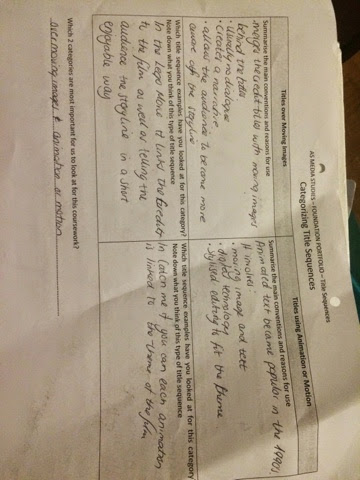
2. Titles over moving images
Merges the credit titles with moving images behind the titles, there is usually no dialogue and it creates a narrative, allowing the audience to become aware of the storyline.
For example in The Lego Movie, it links the credits to the film as well as telling the audience the storyline in a short and enjoyable way.
3. Titles using animation of motion
Moving image and text
Digital technology is used
Stylised editing to fit to the film's theme
For example in Catch Me If You Can, each animation is linked to theme of the film.
4. Titles on still image
More elaborate than the title being on a blank screen, title cards are developed for specific films. They hint the genre of the film as well as use a combination of media to create the background (music/images)
For example in Wimbledon the typeface comes in, in all different directions and the images synchronises with text and background music.


No comments:
Post a Comment